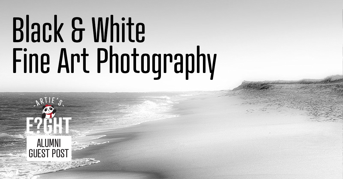
I have seemingly always had an affinity for “black & white.” My first Schwinn bicycle was black; several of my early cars were white; all my cars for the past 23 years have been black, and I recently ordered a new Jeep in yes, white with a black top. Has this lifelong attraction guided me to create black and white art? I don’t know, but what I do know is that I feel something in my black and white work that- to me - is missing in traditional color prints.
All too often you may see a print that someone “converted” from color “just to be B&W” …and it shows. Just making a color image B&W is not creating black and white art, and that is why you see many black and white images with little to no contrast, definition, or impact.

Seeing in Black and White
I believe that key to creating black and white art is in “seeing” in black and white well before the shutter “click”… of being able to recognize the opportunity to render an image that will resonate in black and white; of being able to see the right contrast in shadows and light; seeing varying degrees of gray and securing a simplicity of subject that will allow the story to live…all while viewing your subject in color.
I do recognize that not every subject or situation may work well in black and white. I think that many would argue that sunsets should usually be rendered in color to capture that special moment, but that’s not always the case, at least not for me. Here is a quote from a magazine executive regarding one of my black and white sunset pieces: “You never fail to impress me how you can capture a sunset, and in a black & white format, make it as, or more, stunning than real life.” That is always my goal in creating my black and white art – “to make it as, or more, stunning than real life.” A lofty target, but so much fun to aim for!

The Creative Mind’s Eye
Shooting in RAW does retain color when downloading the files, but I find that when I am processing my files for slight edits and adjustments and that when I press the “black and white” tab in Lightroom, I am usually not surprised at what I see as I have seen this image before I created it. While in the field I recognized the desired subject, contrast, the light and shadows needed to render a dynamic piece in black and white. Yes, there are rare times that after pressing that button I don’t see what “I saw” …and that tells me that at the moment of “click” I missed something and the end result didn’t match my creative mind. Those occasions are a disappointment, but you do learn from it and that is always one of the coolest things of creating in photography. It is rewarding to figure out what was missing on the images that didn’t make the cut; Was it a poor choice of subject? Was it misjudging the light, the shadows, the contrast, or all the above? Or did I simply see something different in my mind’s eye that my real eyes just didn’t capture? If you find yourself in a similar position breaking down that image to scrutinize each element, each camera setting, is a great learning tool…or you may just eventually find yourself asking, “What was I thinking when I took that?” It happens.

The Timelessness of Black and White
Black and white photography transcends time. We look at B&W images taken 50 or more years ago, and they still work…and they work well. In today’s glut of social media color images pouring out of iPhones and such, most of those color images don’t stay in your mind but for a few minutes if that. Of course, there are photographers doing great work in color, but I believe its just harder than ever for even very good color work to stand out in the current sea of color images easily found online, etc. To me, social media has created just as much harm to photography as it has provided incredible viewership.
In my gallery I will often hear one speak of how they love black and white art. Maybe it’s a longing for a style of yesterday, the timelessness of black & white; or maybe in a world encumbered with so many over saturated color images dominating social media and ostensibly everywhere else, the contrast of black and white art brings a freshness to offset so much sameness…or yet perhaps creating in black and white allows the viewer of this art to mentally color outside the lines for themselves.
It’s usually not the best idea to be different just to be different but being good and different on a cluttered stage has its virtues.
Best Frames for Black and White Art
My gallery walls feature many prints in Frame Destination’s Black Wood Frame Profile 503. This tall picture frame moulding completes the gallery look. Its slender, 3/4-inch wide face shows off the actual texture of the wood, but in a subtle way making this frame a complement to the elegance of black and white photography.

For a more dramatic look, I frame with White Wood Frame Profile S24. Suitable for canvases as well as matted prints due to its deep 1 5/16-inch rabbet, this frame is a timeless accent. Its 1-inch wide face and stark white or black color can make any piece of artwork a statement piece.
About the Author
Learn more about the author and see more of his work in our Artie’s Eight Artist Spotlight featuring Bobby Baker.
All images ©️Bobby Baker Fine Art
Last Updated October 5, 2022